Redesigning the 2019 University of Toronto MI Alumni Survey Report
While researching for graduate programs, the career outcomes of alumni are one of the most important elements for the applicants to look at. With data and charts, applicants can evaluate how these outcomes and career paths align with their personal career goals and what they would like to achieve after graduate studies. For this project, I redesigned the Master of Information section of the 2019 MI and MMSt Alumni Survey Report on the University of Toronto website with the goal of making it more appealing and memorable to prospective students.

The Original Report
the 2019 MI & MMSt Alumni Survey Report was written by the Faculty of Information based on the 99 respondents out of 250 students who graduated between November 2017 and June 2018 from the University of Toronto iSchool. This Alumni Survey Report provides insights into the employment success of alumni from both the Master of Information program and the Master of Museum Studies program through 9 sections of data analysis, including “Current Employment Status”, ”Type of Appointment”, “Relationship between Employment and Graduate Studies”, “Time of Securing Employment”, “Supervisory Roles”, “Method of Finding Employment”, “Employment Location”, “Gross Annual Salary”, “Job Titles and Organisations”. Among these 9 sections, 7 charts are used for data visualization.
The report is very comprehensive with information and data in the 9 sections. All the data visualizations within the report are very easy to understand since they are all clearly labeled and supported with explanations. Although the report chooses different types of charts depending on different types of datasets, all the charts are either a pie chart or bar chart that uses blue as the major color, making the whole report seem organized and consistent in terms of the style. Moreover, the data visualization in this report has very high data to ink ratio, which means it does not contain any extra decorations. However, high data to ink ratio does not always yield better data visualization. According to Healy (2018), “infographic” style graphs are more memorable than standard statistical visualizations. So in this case, the consistent, simplistic style might make the report look formal and professional, but less attractive or memorable. There is also not much effort shown for communicating the purposes or the meanings of the data. For example, the report did not directly point out what the employment status chart is trying to tell, instead, it relies on the audience to take an extra step to interpret the meaning of this chart, that over 90% of students landed a position after graduation, which is a high employment rate.
Redesigned for advertising purpose
According to the original survey report, “the primary goal of the 2019 Alumni Survey was to gain insight into alumni’s career paths and employment success”, and doubtless, the original report fulfills its purpose. However, for prospective students, this long report might be less attractive, while it is almost the only source they will be directed to when researching for where the Master of Information programs might take them in the future. Thus, I would like to redesign the data visualization for the prospective students as the targeted audience.
The original survey report has two sections, one for the Master of Information graduates, the other for Master of Museum Study graduates. Since both sections use a similar style and format, I extracted the Master of Information section and redesigned the data visualization in this section as an example.
As for the design tools, I used a digital painting application Procreate and digital graphic design application Adobe Illustrator. I thought of using a JavaScirpt charting library, but I think I would prefer more freedom than the charting libraries would provide.
Title
The title of this section should highlight the key information “Master of Information” to distinguish it from the MMSt section. Also, the keyword “Master of Information” also draws the attention of the audience, especially if they are students who are thinking about applying to these programs. Establishing personal connections with the audience is the most important element of data visualization (Peck, 2019). Thus, besides the title of “Employment Outcomes”, the header of the redesign includes “Class of 2019”, “Master of Information”, and well as a logo of the University of Toronto.
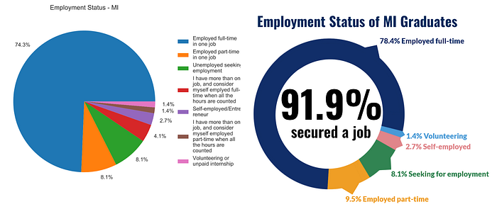
Current Employment Status
In the original design, this section uses a pie chart, which is effective to show the composition of each category of employment status. However, the categories might be a little too specific. For example, prospective students might be only interested in learning whether the graduates are employed full-time or part-time, thus separating the “Employed part-time in one job” category and the “I have more than one job and consider myself employed full-time when all the hours are counted” category might not be necessary. Also, some categories have names or descriptions that are too verbose to engage the audience. So I combined some of the categories and reduced the words for the name of the categories.
As for communicating its purpose, the main takeaway for this chart should be how most of the graduates are full-time employed or part-time employed, while only 8.1% are still seeking employment. However, this is not directly communicated to the audience through the chart. Thus I put a “91.9% secured employment” text with the large font at the center of the pie chart.
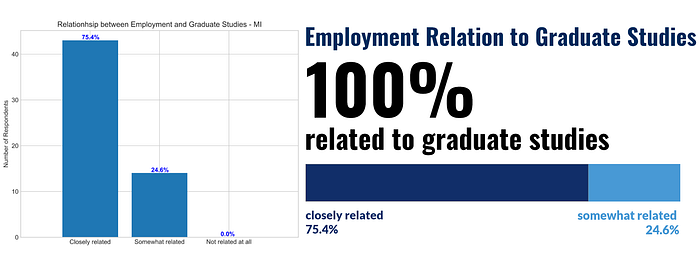
Relationship between Employment and Graduate Studies
The current chart for this section is a bar chart, which does not really represent the percentage very well. The 0% bar of “Not related at all” tries to emphasize the information that ALL employments are related to the graduate studies, but having an empty bar here is a little strange. So I used one horizontal bar to present both the “closely related” category and the “somewhat related” category, and I took out the “not related category” because it is empty. Instead of having an empty bar, I emphasized the information that all employments are related to the graduate studies by simply show a “100%” text with an eye-catching large font.
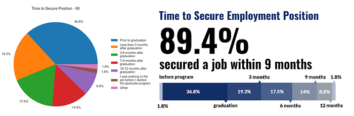
Time to Secure Position
The current chart is a pie chart. Although it does the job of showing the percentages, the data is not presented with the most natural time order. Unlike the pie chart for employment status which had unordered categories, the categories in this data set are ordered by time, so I again used a horizontal bar to show both the time and the percentage. In this way, the horizontal bar provides not only the detailed data percentages but also a sense of a timeline.
When choosing color schemes, designers should not only map data to colors that are perceptually uniform (Healy, 2018). In this case, the length of time and the percentage of employment secured are positively related, so I redesigned the data visualization with the sequential color scheme, with deeper color representing a greater percentage of employment and a sooner time.
Job Locations
The original visualization uses a simple pie chart, and it did a great job highlighting the data of the Greater Ontario Area and Ontario specifically, which makes it a great opportunity to draw personal connections with the audience, especially prospective students from these areas or would like to work in these areas after graduate studies.
Thus, I redesigned the visualization of this section to emphasize geographic information even more by using a map.

Gross Annual Salary
Originally, there are two charts for this section, one displaying the overall average and median gross annual salary of the Master of Information graduates, while the other displaying the average gross annual salary of MI graduates by concentration. For simplicity, I condensed the two charts in my design. The bar charts that were originally used show almost too much detail, which makes it difficult for the audience to locate the key information, so I extracted the numbers, the average gross annual salary, that most audiences care the most.

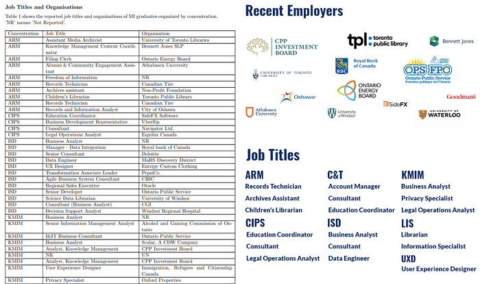
Job Titles and Organizations
In this section, the original report listed the specific job titles and organizations of all the reported employment. Although this detailed list might be helpful as it shows everything from the survey, again, showing everything also means nothing is highlighted. For an audience who wants a simple answer, this list might not be ideal. Thus, I extracted the most common employers and the job titles by concentration from the list and made these into two new sections to replace the original list of job titles and organizations.
Conclusion
As a student who is currently researching for graduate programs, I made the utmost of my current role to help coming up with design ideas that will make the data visualization of employment outcomes actually appeal and help students like me. I still agree that the original report looks more professional with high data to ink ratio and a simplistic design, but I hope the redesign shows another possibility of presenting the data. In the redesign, data visualization focuses more on audience engagement and aims to fulfill the purpose of attracting prospective students and highlighting the main takeaways of the data in a more direct way.
Thanks for reading!
Works Cited
Healy, K. J. (2019). Chatper1 Look at data. Data visualization: A practical introduction. Princeton: Princeton University Press.
Peck, E. (2019, May 20). Data is Personal. What We Learned from 42 Interviews in Rural America. Retrieved October 29, 2020, from https://medium.com/multiple-views-visualization-research-explained/data-is-personal-what-we-learned-from-42-interviews-in-rural-america-93539f25836d
